Saturday, 30 June 2012

Billie Jean; 30 years of Nike poster making

 This 1985 'Vandal' poster was created by Billie Jean (also known as Sam Plyasena). It was created to advertise Nike trainers and its 30 year anniversary of creating the top designer multi-purpose trainers. Sam designed this poster by using bic brio pen on graph paper. By simply doodling anything to do with Nike trainers, he managed to create this..using a pen!!
He mainly used this to show that even the craziest of doodles put together can create an amazing piece of art or the most effective advertisement. 

 After looking at a few more examples of his work (images top, left and bottom left), I think that the Vandal poster has to be my chosen one to analyse simply because it is so amazing how he managed to create something so beautiful just by doodling (which I tend to do a lot - but never knew it could lead to creating something like that!). 


The fact that he managed to get the shadings, shape and design of the shoe perfectly as well as inc-operating other bits and pieces that relate to or describe feelings towards the brand is truly fascinating and has now inspired 
even more to continue doodling (in the right time) and try to create something just as amazing as his work.

The way in which he also tied in a retro theme by adding a rubix cube and pac man game elements, add to the fact that this brand of trainers has been around and just as popular in the retro ages as well as now and also it adds to the retro style that the poster has as well from the way in which he laid everything out - in the style that you would find most retro posters with.


These are my attempts at doing a Billie Jean style drawing and if I do say so myself I am rather happy with it. By simply using nothing else but a biro pen, I began to doodle the song I was listening to which was called Fly Away by Jovi Rockwell (a Caribbean artist). 
I really like how I managed to blend the black and the blue when drawing her face and the hair, also how I tried to find different things that linked with the lyrics i wrote with it as well.


The reason in which I did this drawing was because, I always like to experiment when i come across something new and something that looks interesting and fun, and this was all three in one.


I don't like the fact that despite it still looking good for a first attempt, it looks rushed. I could have spent a bit more time on the hair and eye like paying a bit more attention to detail and being careful with my mark making and shading.


I would change the layout, like where i drew everything, next time I shall do it so its like step by step (it flows in the layout of the lyrics). I would also draw the full face this time, at the time, drawing half the face sounded a bit more interesting until i actually did it - then i thought differently.

Contextual Referencing


In one of our lessons, we were shown these 4 album covers. Clueless at first as to what relevance they had until the teacher explained the task, then we understood. The class was divided up into 4 groups and given an album cover each where we had to answer questions on them.


This is the album cover for coldplay x&y album. Coldplay are formally one of the most recognised and successful British alternative rock bands who date back to 1996, where they were formed by the lead vocalist Chris Martin and the lead guitarist Jonny Buckland in their university days. The album cover was designed by the duo Tappin Gofton (Mark Tappin & Simon Gofton). When I first saw the album cover, I thought it was really plain and boring and the design + layout just isn't something that i would be attracted to.

The Baudot Code

There was something interesting about it though and that was how the used what is known as the Baudot Code, which by looking at the clues it gives you inside the cover, you find that it spells out x and y.

In terms of how the album cover relates to their genre of music, it doesn't relate at all. Personally, they could have been a bit more creative in the sense that especially since they specialise in rock, they should at least try and make the cover relate to their style. I say this because, when I look or come across a rock album, it is normally rather colourful or there is a lot going on on the cover, but here, there i not much happening at all.
The Killers

Where as when you look at these two album covers from the same genre, they have a lot more going on in them and they have been a lot more creative in the layout, colour, font etc. Maybe had they tried to be a bit more creative in and put a bit more thought into it they could have come up with something far more better than what they have.
Fall Out Boy
Like this for example!


This is the logo for cold play. In this case I would say that simplicity has worked well as well. But also, now I see they chose a simple approach to the album cover as well. Now that i think about it, they have actually put a bit more thought into it than I originally thought, because their music is simple an effective, the code on the cover is simple and kind of carries effect in it, in the sense that it spells out the albums' name (not many bands think like that) and the simple colours along with simple text and background colour are again very effective in that you can recognise straight away who it is.

Personally, the logo for the chemical brothers works really well in the sense that the font they had use doesn't really look to healthy and almost like they painted it with poison. I say that because of the brush strokes and the extended tips of the letters and how it stretches out, even makes it look like it was written in Arabic, which to me is definitely one of the best logos i have seen for an album cover, because there are so man things that can link with it whereas you don't normally find that in many others.

This album cover, for me was the best one out of the four that we were showed because, you can tell from the detail in the image, that a lot of thought has gone into it. The name that they gave it works perfectly alongside the 3 images (1 inside and 1 on rear) where it shows the first one (this one) saying "push the button" almost like it is saying switch me on and let me work. The second one shows the person's brain at work (wheels turning in his mind processing words to send to the mouth) then the third showings the words flowing down the brain and out the mouth. It can make him seem like a stereo, which you push the button, it reviews the lyrics and the let's you hear what it is thinking.

The 3 colours work well together too, you have the bright grey adding emphasis to the cold blue words and cracked black bricks and outline, which to me, it would attract my attention and I'm not even a rock music fan...that shows how effective it is.
The target audience for this album and probably to the other albums too would be people with the same taste in rock music and love that head banging drum and distorted guitar sound. The age range I think, varies quite a bit, because you can find young teens around 15 to 18 who like this kind of music or you can find young adults 20's or 30's who also enjoy it. I think it just depends on who the person is.
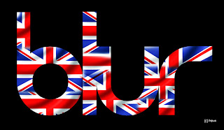
Blur are another English alternative rock band and just like Coldplay, they also formed in London but in 1988. The group consists of  :
  • Lead singer: Damon Albarn
  • Guitarist: Graham Coxon
  • Bass player:  Alex James
  • Drummer: Dave Rowntree 
"The Best Of" was a compilation of their greatest hits formed into an album by the English Britpop band themselves; Blur. It was first released in the late 2000's and is the final album by the Food Records company.

This is the first time I have ever seen this album and my first impresion is that I love it! Firstly, they have used one of my favourite art movements 'Pop Art' to be the design on the cover is very unique and very eye catching. The way in which they used their logo in big writing with a plain white tone to it, against a multi-cooured background, is a very effective way to form an album cover indeed! The way in which they used their imagination to cartoonise the members to fit the theme of Pop Art was one of the best things a band could think of! (I still like The Chemical Brothers though)

The logo for blur is another interesting and unique logo that i have seen on an album cover. Not many bands have thought about adding effects to their album that relate to the bands' name like how blur used the blur effect (found in Adobe Photoshop/Illustrator) or by adding smokey colours to the background to give it a kind of hazey look.

The target audience again just like the chemical brothers and coldplay, it varies a lot because there are a number of people from certain age groups that you find engage in this type of music. So to try and set a specific amount would almost be rather difficult.
I especially like this album because it has shown me that you can inc operate contemporary art movements with design and illustration. It has also inspired me to try something new if it comes to a point where i have to design one.


This is my favourite album of all time by my favourite and inspirational artist; Keri Lynn Hilson. Once started off as a backing singer for several RnB artist, to move on to be a part of a group called D'signe, yet despite their separation she was still having her lyrics sung by Brittney Spears and the legendary Mary J Blige. Recognised for her talents, she was then signed by the top music producer Timbaland where she produced her debut single 'The Way I Are' which then lead to a whole new life for Miss Hilson.

Her 2010/11 album 'No Boy's Allowed' was purposely created for women who have had enough of being mistreated, demanding to be treated properly or have had bad experiences with men and love. 'Toy Soldier', 'So Good' & 'Hustler' despite being unreleased tracks, thy became very popular with those that haven't had a fair chance in love and have spotted the enemy within whom they thought they found love in.

Her choice of imagery for her album is a rather interesting one in fact. She chose to have a warning banner reading 'No Boys Allowed' with a picture of her looking rather stunning against a glamorous background, which when you combine the two together it's trying to say 'Warning, Do Not touch', so its kind of showing them what they are missing out on because of how they have acted.

The target audience for Keri's album/music is kind of set to young teens/young adults a her music is not really the type you would hear someones parents listening to, unless they enjoy these kind of slow, sensual and sometimes explicit lyrics.


Thursday, 28 June 2012

Vector Project


I was set another task to experiment with a movement called 'Vector'. This movement allows you to re-create an image with different colors and add a completely different look from what the original image looked like. These are examples of the final outcomes of vector by Miles Donovan.


I had an attempt at creating a similar outcome using the same style and it proved to be a lot more difficult than it sounded! There were many steps that lead up to the final outcome and i always found i had an issue with the same part, but it still went well.
SO firstly, I had to get another image of my artist of focus: Keri Hilson (a rather beautiful picture it was too) but as usual, I always choose the picture that has too much detail, but i like a challenge.


Before anything else, I had to add a smart blur to it too make it easier to work with, so by going to filter and blur then to smart blur changing the level to 30. Then by going to edit and adjustments I chose posterise, changing it to level 2 (to make it easier to work with). Then, after pressing ok, my image transformed into this:

Posterised version of Keri Hilson
Now I had to create new layers and re-name them to the colours that are shown on the image now. So I created red, yellow, black and white because these were the main colours shown on my image. The next step for me was to now draw around the image layer by layer. For example, I made sure that all other layers were locked and the red layer was unlocked (this allowed me to use the pen tool as it won't work if the layer is locked). Once I had drawn around the areas that had red in, i then locked the red layer and hid it so it won't interfere when it comes to the next layer. Repeating both steps for each layer, when I had finished and hid the actual image I now had a rough line version of the image. 

Then came the colouring in part, so by starting with one layer at a time (starting with red), I chose random colours just to have a bit of fun (but still made sure the colours worked well together). However, I noticed that there was a very big difference between how my image looked and how the tutorial's looked. I think I either missed a step or did something wrong but my image didn't look correct. Either way it was a good first try at Vectoring.

An example of a Vectored image by Miles Donovan


  Typography Portraits                                                                 


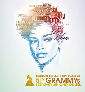
These images of Kelly Rowland & Alicia Keys are currently in the process of forming the work from another movement known as "Typography". They have gone through a few steps already (thats why 2 of the images are in grey scale). There are quite a few steps to follow but the end result makes it worth it all. Following the tutorial on the graphics blog, i was able to create images in a similar way to the ones shown below. 


 So once i had found the pictures of the artists i wanted to use, i then had to tramsfer them to photoshop where i then had to change them from colour to grey scale. So once i had dragged them into photoshop, I then had to go to 'Select - Colour Range' and then i had to change it to shadows, then by pressing command + C and command V to copy it to a new layer. Clicking back on the original layer (the actual picture), I repeat the same steps but, change it to mid-tones, then copying that again to creat a mid-tones layer. After I did that, i had to go to edit, filter and then change it to 50% grey (for mid-tones layer) making sure that preserve transparency was highlighted and then I pressed ok, doing the same for the shadows layer Edit - Fill - then change it to black and press ok. They will end up like these:


After, the next step was when things began to get interesting. I had to find lyrics of the artists and copy them to word, then opening up a new window on photoshop (setting it to cm, 20, 20 & 300), I then clicked on text and drew a text box to fill the page, copied  and pasted the lyrics to photoshop, setting the font to edwardian and size 30. Then i pasted the lyrics to fill the page.


Then i had to create the text into a brush, so i had to press command + A to select it all and then go to edit and define brush preset to create a brush. Then after creating a new layer, I went to the images and  then painted the lyrics on top with the brush. So now i have a layer with a picture with lyrics, one with shadows and one with mid-tones. Then i had to merge the shadow and mid layers together. So i had to hide the text layer and click on the shadow layer then hold shift and click on the mids layer then pressed command + E to merge them together. Now i had to make a mask layer so by going to the text layer, I then pressed the 3rd icon in the layers box (mask) and created a white box next to the text layer. I had to copy the pixels from the merged shadows and mids to the mask layer. I had to inverse the image so by pressing Command + I, I changed the image to negative. 


I turned on the text layer again but, hid the grey scale layer so all i had was a almost silhouetted image with text around it. No i had to add the colour to it. So by clicking in the top, right corner of the layers box (next to paths) i went to blending options and went down to Gradient overall. Changing it from normal to screen, I then went on to choosing my colour blend, playing with the directions etc then pressed ok. I then got the brush tool and chose a soft brush, reducing the size to 15 and the opacity levels to 42%, I went over the picture so bring out the face more (so like the eyes, nose, mouth and hair) and then I had successfully created my Typography Portraits.


Wednesday, 27 June 2012


Stitching Experiment


From the first part of our As - A2 project, where we had to create 9 pin boards of the different graphics movements, we now do lessons where we carry out experiments that link with the movements we have done. 

This movement is called stitching. it was a rather fun experiment. It involved creativity and patience (well in my opinion it did). 
The first step was that the teacher took us out one by one to take primary photos of us doing different poses which we were then going to transform into silhouettes and then stitch patterns to form the shape of the silhouette ( NOT LITERALLY STITCH).

So after we took the pictures, we then transferred them into photoshop where the next 
step then begins ( and where patience is definitely a virtue).  The next step was to get the pen tool and begin to draw around the person to create the silhouette. however before that, we needed to make sure that the opacity level was around 40% so that you can still see the image clearly and where you are drawing around. Then once I had drawn around the figure, I had to change the opacity level to 100% so that I now have a complete silhouette of the figure.


I then created a new file, where i then dragged the silhouette across. I then dragged a swatch from the swatch library directly over the silhouette and then placed it in position by clicking place and then I went to layer and then create clipping mask, this then cut the silhouette out from the swatch pattern. 


Carrying out the same steps for the second figure, i placed the figures on the same page but in a certain position so that it related to the album i was doing which is called "No Boys Allowed" by an artist called Keri Hilson. (Serious inspiration of an artist!!)